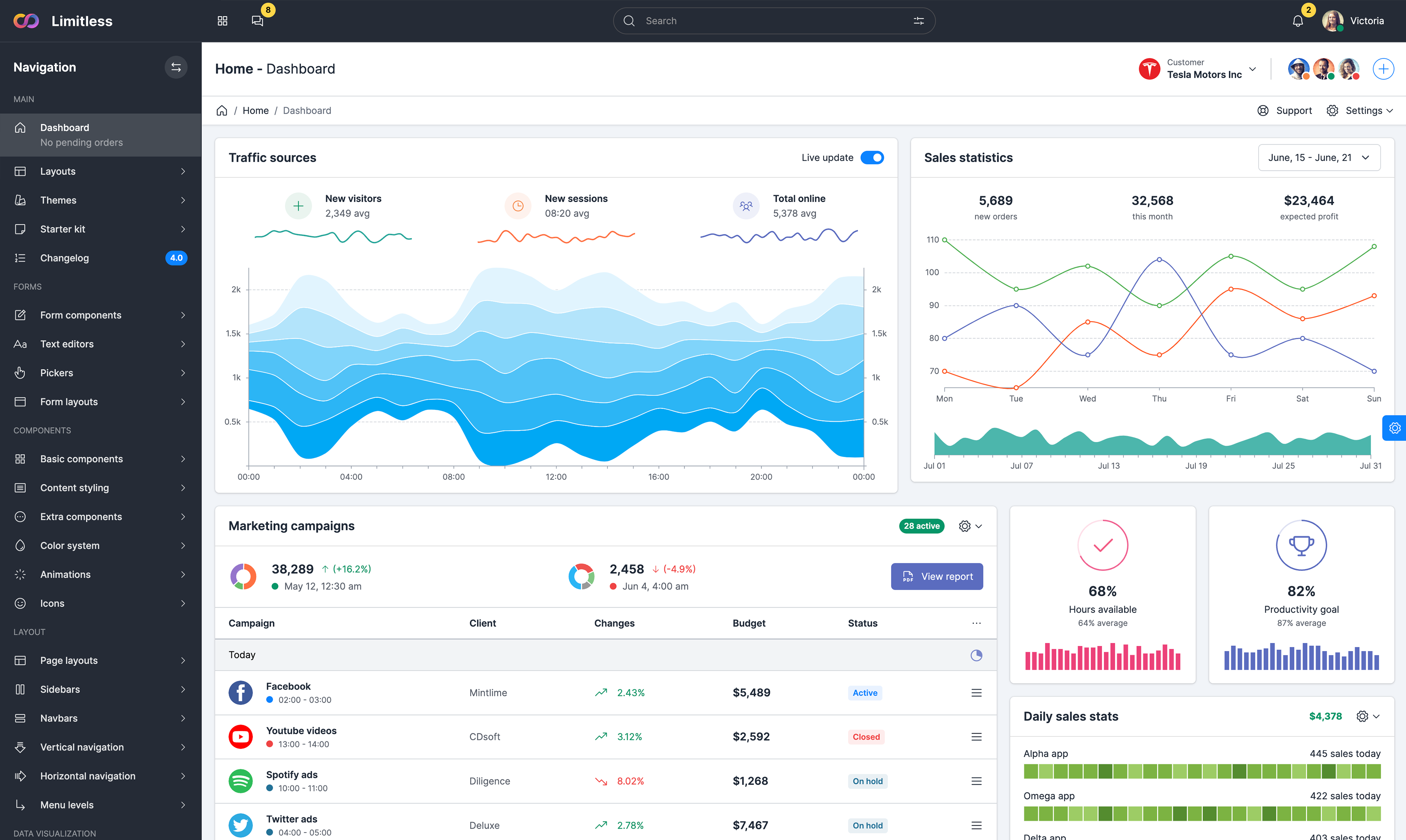


Simple interaction
This interactive bar chart demonstrates basic interactivity: tooltips that display bar value; multiple data sets with smooth animation between them; color range option; bar value position and appearance. "Change data set" checkbox changes data sets and launches smooth transition between them, uncheck this checkbox to change data set to the first one. Tooltip is a D3 plugin that is called directly in chart settings.
Sortable vertical bar chart
This variation of a simple bar chart adds sorting with staggered delay and translucency to improve readability during the transition. Use the checkbox in the top right to turn sorting on or off. During the sort, bars keep their default colors for better visibility. There's an additional side padding added to the chart area, distance between bars as well as their size are fully customizable.
Sortable horizontal bar chart
Another example demonstrating how to sort a horizontal bar chart and animate the reordering. The staggered delay makes it easier to follow individual bars. As in horizontal bar chart example, bars keep their original colors. Optional value text can be placed on the left and right sides or centered. Bar height depend on chart container height and bar number displayed.
Stacked to multiples
This variation of a stacked bar chart adds an option to change stacked bar chart to multiple on the fly by selecting the radio button. Chart labels move according to the bar group position. This type of layout and transitions are available for both bar directions - vertical and horizontal. It uses one data set for both chart types. Vertical axes labels are optional and hidden by default.
Histogram with tooltip
This example shows basic histogram with optional tooltip. The data is randomly generated. The values are then binned at regular intervals using D3’s histogram layout. The x-axis uses a linear scale, such that the tick values appear between bars; this provides better indication that each bar represents the count of values between its surrounding tick values.
Hierarchical bar chart
This bar chart visualizes hierarchical data using D3. Each blue bar represents a folder, whose length encodes the total size of all files in that folder (and all subfolders). Clicking on a bar dives into that folder, while clicking on the background bubbles back up to the parent folder. Data stored in JSON file.